Sometimes it makes sense for Android apps to use horizontal progressbars to display quantitative data. The problem in using progressbars for this is that the colour is linked to the current theme of the ROM you are using. In generic Android this is a ghastly yellow and in the Desire ROM it is an even worse green colour. While it's not too bad if the progressbar is just being used as a progress bar, it isn't exactly desirable when using it to show data in your app. The good news is that you can manually theme the progressbar to suit your app and make it consistent between different ROMs.
This tutorial is relatively simple but it does assume you have a working Eclipse environment setup for Android development.
As we will be skinning a determinate horizontal progress bar, as apposed to the circular animated progress bar, ensure that the style of your progress bar is set as follows:
?android:attr/progressBarStyleHorizontal
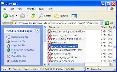
When the Android OS displays a view it uses a default xml drawable file to determine what colours should be used when displaying. As we don't want to start skinning the bar from scratch, we'll take the default file and copy it into our projects drawable folder. The file we will need is found at:
<AndroidSDK Root Directory>\platforms\android-<version>\data\res\drawable

Now that we have our own copy of the progressbar's drawable file we want to set the progress drawable attribute of our progress bar to point to it. To do this select the target progressbar and scroll down to Progress Drawable in properties. In the values section type @drawable/progress_horizontal, alternatively you can use the ... button in the Progress Drawable value field and browse for it.

Now that we have our progressbar pointing to our own drawable we can start to modify the XML. Open up the drawable XML file in Eclipse and you will see that it contains three main sections/ You can safetly ignore the background section as we are only interested in the secondaryProgress and progress sections.
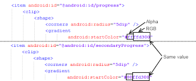
You'll notice that each of these sections contains three colour values for creating gradients, startColor, centerColor and endColor. Each of these colour values are broken up into two parts, a two digit alpha value and a six digit RGB value.

An important thing to note is that the only difference between the startColor, centerColor and endColor of the progress section and the startColor, centerColor and endColor of the secondaryProgress section is the alpha values. This means that when we modify the RGB value of one value we must also copy it across to the corresponding value in the other section. Be careful not to accidentally copy over the alpha portion, it will throw off the 3D effect.
To begin customizing the theme we must first pick the desired colour. Fire up your favorite photo editing program and pick your desired colour on the colour picker. Now copy the corresponding RGB values into the CenterColor fields in both sections. Remember not to copy over the alpha values.
Next we want to lighten the colour a couple of shades and copy the RGB values into both endColor fields. Lighten the colour again, but this time copy the RGB values into the startColor fields. By using three different shades we are able to keep a consistent 3D look like that of the original progressbar.
There you have it, a custom themed progressbar. You may need to tweak the shading differences a few times to get the best results.


